The Tools of the Trade: How PowerPoint has failed Leaders
by Lori Lawson
As leaders, many of us tend to focus more on what is said rather than how it is said. What my goal here is today is to have you reevaluate one of the most prevalent tools that leaders use to present information: the PowerPoint. Recently my History 390 course brought up how slideware programs are the latest craze in information sharing, yet they are often severely detrimental to the information being presented. Need proof? Here is my personal blog entry on the topic.
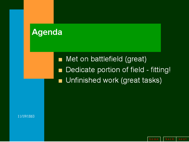
Slide from “The Gettysburg Address PowerPoint.”
One of the most convincing arguments made against PowerPoint and like programs was this representation of how one famous leader’s speech could have turned out disastrous had it relied on the use of a slideware program. Look familiar? it is the Gettysburg Address by President Abraham Lincoln – one of the most influential presidents in American History. Between the wording, garish color choices, and potential technical difficulties, the true impact of his words are almost completely lost. It is clear the often time we use PowerPoint as a crutch, which instead of actually supporting our argument like so many predicted as its impact, turns against us and detracts from it.
PowerPoint is just one example: several tools that are supposed to “help” leaders in their tasks are also guilty of detracting information. What I urge all of you to do is evaluate the tools you use as a leader and whether they actually help you. Sure, a well made PowerPoint can certainly aid in a presentation, but is it appropriate for your situation? Additionally, does it accurately convey your point? As students, I can certainly speak for most of us that we have all too often seen PowerPoints where the graphs are misleading and the points are poorly ordered.
But for now, lets return to the ever popular PowerPoint and similar slideware programs. In order to help you evaluate the effectiveness of your PowerPoints, I would like to introduce the acronym “CARP” (switch the A and the R if you must), which was brought up by my History 390 professor Dan Cohen in that very same lecture. C is for the colors used in your presentation, A is for alignment, R is for repetition, and P is for proximity. To outline these more specifically, your colors should be both high contrast and appropriate for the tone of your presentation (i.e. no hot pink for a Holocaust presentation). Alignment refers to the point that items of similar important or type should share a similar alignment. Repetition means that the same style should be used for similar points throughout the presentation and should allow for the viewer to easily identify like points as the presentation progresses. Finally, proximity means that related points should appear near each other.
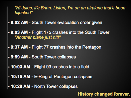
Note the aspects of CARP present in this timeline slide I created on the 9/11 terrorist attacks.
So leaders, once more I urge you to reassess the tools you use to get your message across. While sometimes a visual aid is appropriate, often just you and your words will make an even stronger impact. Don’t ever let yourself be caught in the latest technology trend when it just simply isn’t working for you. We all know the downsides through our years of being a student, but that is no reason that we should continue the pattern into the future. Just imagine where Lincoln would be had he used that PowerPoint!
What leadership tools do you feel detract from presentations? How can they be improved? When are slideware programs most appropriate? When are they not? Let me know in the comments!
November 18th, 2012 at 12:56 am
Excellent point, Lori! I feel that people oftentimes abuse the PowerPoint. What was designed to offer small bits of information to reinforce a presentation has now morphed into a winded, monologue squeezed onto one page- frequently in colors or font that is indecipherable. It’s quite unfortunate. There is hope, though, for Prezi. Prezi is designed in such a way that it is more difficult to add large chunks of text at a time. Also, Prezi keeps your attention as it utilizes every adverb imaginable to get from point to point.
For more successful presentation, people overall need to make sure they are representing only the most vital information in text, and filling in the rest with further vocal explanation of a point. This makes an audience much more likely to listen to what you actually SAY, and not depend on text alone. The PowerPoint needs a good balance of text, speech, and visuals like photos or graphs.